
Data Apps
The popularity of data applications, or data apps for short, continues to rise as they are being adopted by many organizations operating in various domains.
Data applications are essentially web applications in which the focus is the presentation or interaction with data. One can argue they are a significant improvement over dashboards built with standard BI tools. When you build a data app with a language such as Python, you have the power to fit it exactly to your needs. Data apps do not necessarily provide just slicing and dicing of preselected data. You can leverage the breadth of the Python ecosystem to display a large variety of custom visualizations, bring in a plethora of domain specific statistical analysis and machine learning tools, connect to external data sources and services.. the possibilities are endless.
Thus, it is no wonder that data apps are gaining popularity. In their basic form, they facilitate the communication between technical teams and stakeholders. When made interactive, they allow non-technical users to dig into the data themselves. Even more so, data apps are frequently used to demo new ideas, build proof of concepts or even entire products.
One point on which data apps are criticized is the technical knowledge required to build them. While one can create at least a very simple dashboard with a point-and-click interface with most BI tools, building a data app requires some technical knowledge of a programming language such as Python and the ecosystem around it.
Data apps promise a fully interactive, often real-time user experience. As data volumes continue to grow, this promise may be a big challenging to keep.
In what follows we will show you how you can create an interactive dashboard that processes over 600 millions rows for every interaction, and at the same time keeping the technical barrier low. The emphasis here is on simplicity, both in how to create the dashboard, and how to handle large volumes of data with a minimal infrastructure setup involved. So let's get started!
Why Streamlit
Streamlit is a framework for creating interactive data apps in Python. Among the various Python frameworks for building dashboards, Streamlit is unmatched when it comes to simplicity and rapid development. In essence, Streamlit provides a variety of interactive components which you can use to dynamically set a variable in your Python script. The concept of the framework are simple: when an interaction with a component is detected, the underlying script is re-run, and the outputs are refreshed. It is as simple as that! Check out this basic example:
import streamlit as st
import numpy as np
import matplotlib.pyplot as plt

st.subheader('Hallo wave!')  # Let's create a title for our app

# These are two parameters we want to modify interactively, by means of a slider
phi = st.slider(label='phase', min_value=-2*np.pi, max_value=2*np.pi, value=0.0, step=0.1)
freq = st.slider(label='frequency', min_value=0.1, max_value=5.0, value=1.0, step=0.1)

# Use the parameters above for some computation
x = np.linspace(-2*np.pi, 2*np.pi, 1000)
y = np.sin(freq * (x + phi))

# Let's plot the results of the above computations
fig, ax = plt.subplots()
fig.set_size_inches(9, 4)
ax.plot(x, y)

# Display the result!
st.pyplot(fig)
Running the above example with streamlit run example.py in your console results in a app like this:
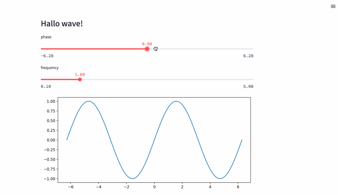
With just a few lines of code you can create simple but informative data apps. There is no need to know front end technologies or web design. It is this simplicity that make Streamlit such a popular choice for creating data apps. This is reflected by its vibrant community, that has built so many useful and creative examples, as well as additional interactive components.
Why Vaex
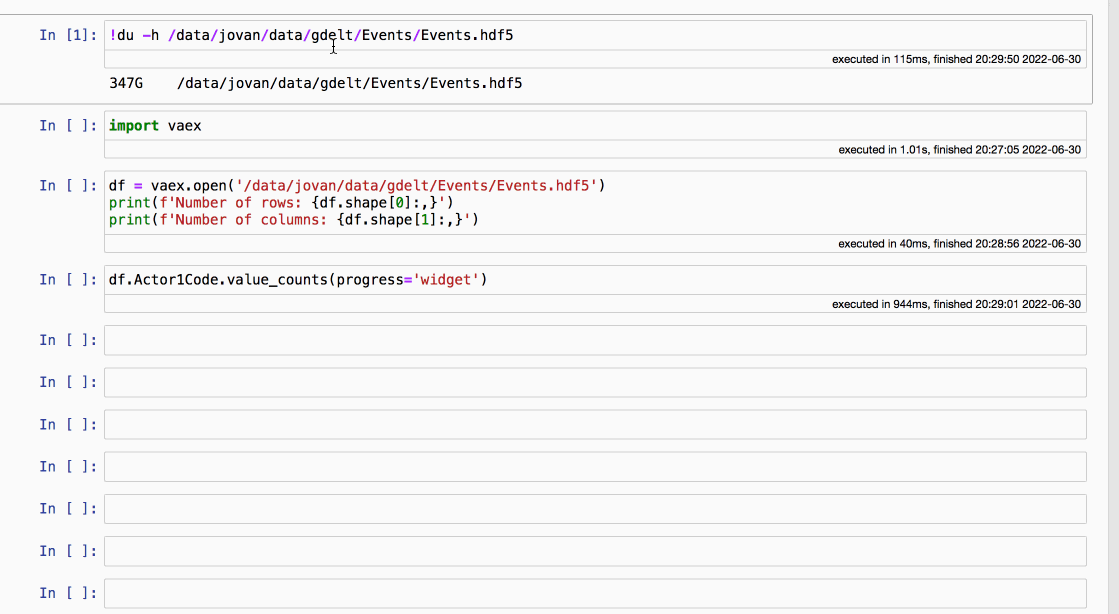
Vaex is a DataFrame library in Python, that has been built from the ground up to handle data volumes much bigger than available RAM. Vaex does not store the data in memory, but only lazily reads the parts it needs from disk. Under the hood lie efficient, parallelized C++ algorithms that ensure fast performance. Look how easy it is to work over 300GB of data:
The above example perfectly illustrates why Vaex is an excellent backend for data apps. Even with such large volume of data, Vaex is fast enough to provide real-time interaction with the data. On top of that, Vaex provides some advanced features such as caching and delayed evaluations that help to significantly optimize the performance of a data app. We will showcase these features in the complete example below.
Exploring the worlds news with the GDELT dataset
For this example we will use the GDELT dataset. The GDELT Project monitors the world's broadcast, print and web news around the globe in over 100 languages. It identifies people, locations, organizations, themes, emotions, events and other entities that continuously drive our society. We can use it to get a global perspective of what happens and how the world feels about it. The dataset itself is updated ever 15 minutes and is publicly available on BigQuery and on GDLET's own FTP servers.
Here we will use the "Events" portion of the dataset. It is a collection of worldwide activities, i.e. events, in over 300 categories, such as diplomatic exchanges, natural disasters or other significant events of relevance. Each event record comprises over over 50 fields capturing many different aspects of the event. The snapshot used in this app ranges from February 2014 until April 2022, and comprises a little over 625 million events.
There are many ways one can analyze this dataset, but we will be focusing on the "actors". Actors are the entities that are involved in the events captured by GDELT. They can be people, organizations, countries, or any other entity or object that were the main topic of the news reports. We will focus on the actor type attributes, which are 3-character codes that describe the "type" or "role" of the actor. Example of such types or roles are "Police Force", "Government", or "Non-governmental Organizations". For more info about the actor attributes check out the GDELT event cookbook.
With that out of the way, let us move to the fun stuff. If you just want to see and play around with the app, you can follow this link. If you want to browse the source code of the whole project on your own pace, it has been open-sourced here.
Now our app has two pages. The first is basically an "About" page, and contains pretty much the same info as above. It is fairly trivial to make as it contains only static text. The second page lets us dig in and present one aspect of the GDELT Events dataset, and we will focus our discussion on it.
We can split the main part of our app into 3 logical sections: a set of functions that filter the data based on the user input and compute the statistics we are about, functions that are responsible for the visualization of those statistics, and finally a section that combines the previous two.
Let's go over the first section. We start by importing the relevant libraries and loading the data.
from collections import Counter
from operator import itemgetter
import datetime
import streamlit as st
import numpy as np
import plotly.express as px
import plotly.graph_objects as go
import vaex
from wordcloud import WordCloud
from actor_codes import actor_codes

# Turn cache on
vaex.cache.on()

# Load the data
df = vaex.open('/data/gdelt/events_v2_streamlit.hdf5')
Note that opening a HDF5, Arrow or Parquet file with Vaex is instant no matter its size, since the file is memory mapped. The relevant data will be streamed from disk only when needed. There is actually no "loading" of the data, we simply point to its location.
We also are turning on the caching option in Vaex. This is a very handy feature, especially when building dashboards or data apps. While Streamlit itself provides a handy way of caching results of functions by monitoring the input arguments, Vaex does this on a much deeper level. Vaex create caches for its internal tasks. That way certain internal computations can be reused even when the input arguments, optimizing the overall performance of the app. You can learn more about caching in Vaex in this guide.
Now let's go over the functions that comprise the "backend" of our app. The following function is responsible for filtering the data:
def create_filter(codes, date_min, date_max):
    filter = (df.Actor1Type1Code.isin(codes) |
              df.Actor1Type2Code.isin(codes) |
              df.Actor1Type3Code.isin(codes) |
              df.Actor2Type1Code.isin(codes) |
              df.Actor2Type2Code.isin(codes) |
              df.Actor2Type3Code.isin(codes))
    if date_min is not None:
        filter = filter & (df.Date >= date_min)
    if date_max is not None:
        filter = filter & (df.Date <= date_max)

    return filter
In the GDELT Event2 dataset, an event can have up to two actors, with each having up to 3 distinct codes. Adding an optional date limits for the events means that for each interaction with the app we need to filter the data across 6 to 8 columns. Remember that we are doing this for 650 million rows, and in real-time!
The next function computes all of the relevant statistics we are interested in:
def compute_data(filter, binner_resolution, progress_function=None):
    # Filter the data
    dff = df.filter(filter)

    ## Aggregators for the global (worldwide trackers)
    aggs_global = {'mean_avg_tone': vaex.agg.mean(dff.AvgTone),
                   'std_avg_tone': vaex.agg.std(dff.AvgTone),
                   'mean_goldstein_scale': vaex.agg.mean(dff.GoldsteinScale),
                   'std_goldstein_scale': vaex.agg.std(dff.GoldsteinScale)}

    # Aggregators per country
    aggs_country = {'counts': 'count',
                    'avg_tone_sum': vaex.agg.sum(dff.AvgTone),
                    'goldstein_scale_sum': vaex.agg.sum(dff.GoldsteinScale),
                    'num_articles': vaex.agg.sum(dff.NumArticles),
                    'num_sources': vaex.agg.sum(dff.NumSources)}

    # Combine the country results
    aggs_country_combine = {'avg_tone': vaex.agg.sum('avg_tone_sum') / vaex.agg.sum('counts'),
                            'avg_tone': vaex.agg.sum('avg_tone_sum') / vaex.agg.sum('counts'),
                            'goldstein_scale': vaex.agg.sum('goldstein_scale_sum') / vaex.agg.sum('counts'),
                            'num_events': vaex.agg.sum('counts'),
                            'num_articles': vaex.agg.sum('num_articles'),
                            'num_sources': vaex.agg.sum('num_sources')}
    main_tree = vaex.progress.tree(progress_function)
    progress_groupby = main_tree.add("groupby")
    progress_agg = main_tree.add("agg")


    # Do the main operations, optimized pass over the data
    with progress_groupby:
        # The global single value summary stats
        total_events = dff.count(delay=True)
        avg_stats = dff.mean([dff.AvgTone, dff.GoldsteinScale], delay=True)
        total_stats = dff.sum([dff.NumSources, dff.NumArticles], delay=True)

        # Groupby per some time interval to plot the evolution of the tone and goldstein scale
        gdf = dff.groupby(vaex.BinnerTime(dff.Date, resolution=binner_resolution[0]), delay=True)


        # Groupby per country. There are two country codes (for each actor) so we do this twice and merge the results
        gdfc1 = dff.groupby(dff.Actor1CountryCode, delay=True)
        gdfc2 = dff.groupby(dff.Actor2CountryCode, delay=True)

        # Actor names - for the world cloud
        actor_names1 = dff.Actor1Name.value_counts(dropna=True, delay=True)
        actor_names2 = dff.Actor2Name.value_counts(dropna=True, delay=True)

        # Execute!
        dff.execute()

    # Gather the results of the computational graph
    # Global single value summary stats
    avg_tone, goldstein_scale = avg_stats.get()
    total_sources, total_articles = total_stats.get()

    with progress_agg:
        # Stats aggregated temporally
        gdf = gdf.get().agg(aggs_global)

        # Stats aggregated per country
        gdfc1 = gdfc1.get().agg(aggs_country)
        gdfc2 = gdfc2.get().agg(aggs_country)

    gdfc1.rename('Actor1CountryCode', 'CountryCode');
    gdfc2.rename('Actor2CountryCode', 'CountryCode');

    gdfc = vaex.concat((gdfc1, gdfc2))

    gdfc = gdfc.groupby('CountryCode').agg(aggs_country_combine)
    gdfc = gdfc.dropna(['CountryCode'])

    # Combine the two value counts result - a single dict of actor codes
    actor_names = Counter(actor_names1.get().to_dict()) + Counter(actor_names2.get().to_dict())
    del actor_names['missing']
    actor_names = dict(sorted(actor_names.items(), key = itemgetter(1), reverse = True)[:300])

    return avg_tone, goldstein_scale, total_events.get(), total_sources, total_articles, gdf, gdfc, actor_names
The function above might look lengthy at first glance, but all it does is filter the original DataFrame with the filter we calculated with the create_filter function earlier, followed by a number of groupby aggregations, and computations of statistics such as means, standard deviations and frequencies of relevant quantities. We consider all of these computations to be fairly standard in data science and analytics.
What is worth discussing is how Vaex optimizes those computations via delayed executions. You may have noticed that many methods in the compute_data function above have the delayed=True argument. When this argument is passed, Vaex will not execute the methods right away, and instead of the answer a promise is returned. After calling the .execute() method on the relevant DataFrame, Vaex will execute all pending methods, taking care to make as few passes over the data as possible, and thus ensuring a great performance. With this the promisees are resolved and the results can be obtained via the .get() method. You can learn more about the delayed argument and asynchronous programming with Vaex in this guide.
Another cool feature that Vaex offers is progress bars. They are especially useful when working with larger datasets, as they are helpful indicators of the expected time a set of operation is likely to take. This is quite useful both for the maker and the user of a dashboard or a data app. Vaex provides a few different options on how to track the progress of various methods, and this integrates seamlessly with Streamlit via the st.progress component. For a more detailed explanation on how to use progress bars in Vaex, check out this guide.
In the next section we create visualizations of the results computed above. For this we chose the Plotly visualization library, since we find their graphs pretty and they offer additional interactivity out of the box. We will not discuss the code in this section, since we consider it to be a fairly typical boilerplate when it comes to creating and prettifying standard plots. In any case, you are welcome to see the full code on GitHub. The important thing to note here is that Streamlit supports displaying Plotly graphs, as well as a variety of other popular Python visualization libraries.
Now it is time to put it all together, and present the control and display components to the user so they can interact with the app:
# Choose actor codes
codes = st.sidebar.multiselect(
    label='Select Actor Types',
    default='EDU',
    options=list(actor_codes.keys()),
    help='Select one ore more Actor Type codes.')

# Specify date range
date_range = st.sidebar.slider(
    label='Date Range',
    min_value=datetime.date(2014, 2, 18),
    max_value=datetime.date(2022, 4, 2),
    value=(datetime.date(2014, 2, 18), datetime.date(2022, 4, 2)),
    step=datetime.timedelta(days=1),
    help='Select a date range.')

# Specify time resolution
binner_resolution = st.sidebar.selectbox(label='Time Resolution', options=['Day', 'Week', 'Month', 'Year'], index=1)
The above code snippet defines the components the user can interact with: a multi-select dropdown with a search bar to choose one or more actor code, a slider component to select a date range of interest, and a simple dropdown menu to choose a time resolution for the aggregation of the data. Streamlit makes this easy - with just a couple of one-liners and you have pretty interactive components, acting like inputs to the underlying python script. No need to know HTML, CSS or JavaScript.
When the value of any of the above interactive components changes, Streamlit will re-run the underlying Python script, and will display the end results to the user. Speaking of the end results, here is how we put all of this together:
st.title('GDELT Actor Explorer')

if len(codes) > 0:

    st.subheader('Actor types selected')
    st.markdown(get_actor_code_descriptions(codes))

    # Compute the filter
    filter = create_filter(codes, date_min, date_max)
    # Compute all relevant data needed for visualisation
    data = compute_data(filter=filter, binner_resolution=binner_resolution, progress_function=_progress_function)

    # The visualisation of the data starts here

    # Plot the global single value summary stats
    avg_tone, goldstein_scale, total_events, total_sources, total_articles, gdf, gdfc, actor_names = data

    st.subheader('Summary statistics')
    metric_cols = st.columns(5)
    metric_cols[0].metric(label='Events', value=human_format(total_events))
    metric_cols[1].metric(label='Articles', value=human_format(total_articles))
    metric_cols[2].metric(label='Sources', value=human_format(total_sources))
    metric_cols[3].metric(label='Avg. Tone', value=f'{avg_tone:.2f}')
    metric_cols[4].metric(label='Goldstein Scale', value=f'{goldstein_scale:.2f}')

    col_left, col_right = st.columns(2)
    col_left.subheader(f'Average Tone per {binner_resolution.lower()}')
    col_left.plotly_chart(create_line_plot(gdf, 'Date', 'mean_avg_tone', 'std_avg_tone'),
                          use_container_width=True)

    col_right.subheader(f'Goldstein scale per {binner_resolution.lower()}')
    col_right.plotly_chart(create_line_plot(gdf, 'Date', 'mean_goldstein_scale', 'std_goldstein_scale'),
                            use_container_width=True)

    st.subheader('Event statistics per Country')
    st.plotly_chart(create_world_map(gdfc), use_container_width=True)

    st.subheader('Actor names wordcloud')
    st.plotly_chart(create_wordcloud(actor_names), use_container_width=True)

else:
    st.error('No actor codes selected. Please select at least one actor code.')
    st.stop()
The above snippet, which can be taken to be the "main" part of the app, starts with calls to the two "backend" functions create_filter and compute_data. The arguments to these functions are provided via the interactive Streamlit components. After that it is just a matter of displaying the statistics in a layout that we find appealing, and Streamlit does an excellent job of simplifying this process.
Finally we are ready to deploy the app, which is quite trivial: execute the streamlit run app.py command in your terminal and you are good to go!
If you have not already done so, you can try out the the app here.
Key points to remember
Streamlit is an excellent framework for building data apps. With just a few one liners you get access to a variety of interactive components, that can be easily used to interact with your, data, models or visualizations. No need to know HTML, CSS or any front-end technologies. Basic Python knowledge is all you need to get started and create informative and visually appealing apps.
When it comes to handling and processing the data, Vaex is an ideal "backend engine" to any dashboard solution, and integrates very well with Streamlit. Just consider the example above. In just a couple of seconds, Vaex manages to filter across 8 columns, calculate various statistics, and perform several groupby operations with numerous aggregations in each. And all of that on a single machine!
Indeed, Vaex sports a number of features that are ideal for building dashboards or data apps: the advanced caching option makes repeated and similar computations faster, and the delayed executions allow for Vaex to optimize the processing of the data ensuring efficient performance. On top of that, the two key concepts on which Vaex is built, lazy evaluations and memory mapping, ensure that you can work with very large datasets and not worry about memory usage. Last but certainly not least, since it a single node solution, it is much easier to productionize, deploy and maintain dashboards built with Vaex.
Strive for more
In this article we were focusing on simplicity: how to build a straightforward data app, even when the size of the data is much larger then available RAM. But sometimes you need to go beyond that. Sometimes, you need to build greater and grander things. Applications with many pages and dozens of components on each, connecting to many internal and external APIs, offering a higher degree of interactivity and flexibility. In essence, sometimes you want the freedom to build anything that your mind desires. You are bound to reach some limitations. Every technology has them.
Streamlit is an excellent framework for building a variety of data apps, sharing results and demonstration of concepts. However it does have its drawbacks. Interacting with a Streamlit app results in re-running of the entire underlying Python script, and re-rendering the entire UI, even for components that should remain unchanged. It is as of yet impossible to isolate components, and trigger a subset of functions and update only specific components without re-running everything. In addition, Streamlit does not react to all events. For instance we can not trigger certain functionality in our app by clicking or making selections on a figure. This may be a problem for larger applications that want to offer more a complex functionality.
If you want to build larger, more complex applications, websites or entire products, we have an elegant and yet powerful solution: a brand new Python framework called Solara. Stay tuned for our next big announcement!
Are you working on a Python dashboard or a data app and you need help optimizing its performance, or some related custom functionality? Reach out to us at vaex.io, we are happy to help.