
Air travel has had a profound effect on our society. It is one of the main drivers of globalisation. Commercialization of air travel made our world a smaller, more connected place. People can easily explore the far corners of the Earth, and build relationships with cultures far removed from their own. Businesses can grow and link with one another, and goods can be shipped world wide in a matter of hours.
In this article we will conduct an exploratory data analysis of nearly 200 million flights conducted by various airlines in the United States over the past 30 years. The data is curated and can be downloaded from the United States Department of Transportation. It contains various information for each recorded flight, such as the origin, destination and the distance between them, the date and time of departure and arrival, details regarding delays or cancellations, information about the operating airline, and so on.
This dataset is not Big-big, i.e. not 100s of Terabytes in size. Still, it does contain nearly 200 million samples and 29 columns taking up ~23GB on disk. You might think a comprehensive data analysis might require a beefy Cloud instance, or a small cluster even, to avoid running into memory problems and speed up computations. Alternatively, one can resort to sub-sampling, perhaps focusing on a few of the more recent years of flight data. However, none of this is actually necessary. In fact, the entire analysis that I am about present was conducted on my 2013 13" MacBook Pro, and with standard Python tooling. How you wonder?

Enter Vaex. Vaex is an open-source DataFrame library (akin to Pandas). With Vaex one can work with tabular datasets of arbitrary size without running into memory issues. As long as the data can fit on your hard-drive, you are good to go. The trick is to convert the data to a memory mappable file format such Apache Arrow, Apache Parquet or HDF5. Once that is done, Vaex will use its fast out-of-core algorithms for the computation of various statistics, or any task related to preprocessing and exploring tabular datasets.
The complete analysis is available in this Jupyter notebook, and here you can see how the raw data files (zipped CSVs) were converted into the memory-mappable HDF5 file format.
Prepare for take off
Let us get started by reading in the dataset we are going to analyse:
# read in the data
df = vaex.open('./original_data/hdf5/airline_data_1988_2018.hd5')
Opening a memory-mappable file with Vaex is instant, and it does not matter if the file is 1GB or 1TB large.
Whenever I face a dataset I am unfamiliar with, my typical first step is to get a high level overview of its contents. The describe method gives such an overview of the DataFrame, and it shows the data type, the number of entries and missing values for each column. In addition, for each numerical column it also shows the mean, standard deviation, minimum and maximum values. All this is done with a single pass over the data!
df.describe()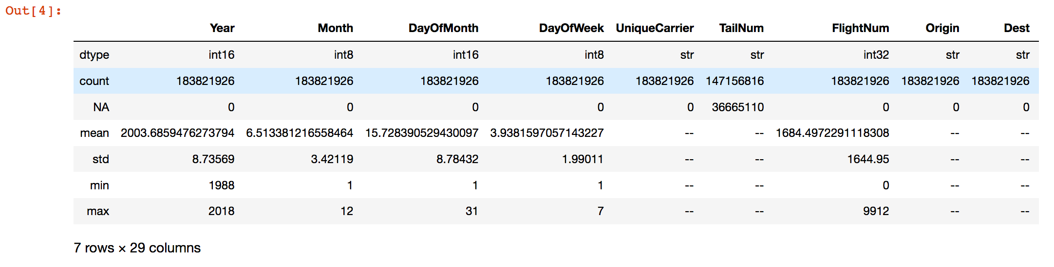 Fig. 1: The output of the
 describe() method in a Jupyter notebook.
Based on the output of the describe method, we can do an initial filtering of the data. Namely, removing the non-physical negative durations and distances:
df_filtered = df[((df.ActualElapsedTime>=0).fillmissing(True)) &
                 ((df.CRSElapsedTime>=0).fillmissing(True)) &
                 ((df.AirTime>0).fillmissing(True)) &
                 ((df.Distance > 0).fillmissing(True))]
This is an excellent point to stop for a minute and appreciate how Vaex does things. Other frequently used data science tools will require ~23 GB of RAM just be able to load and inspect this dataset. A filtering operation like the one shown above will require another ~20GB of RAM to store the filtered DataFrame. Vaex requires negligible amounts of RAM for inspection and interaction with a dataset of arbitrary size, since it lazily reads it from disk. In addition, the filtering operation above creates a shallow copy, which is just a reference to the original DataFrame on which a binary mask is applied, selecting which rows to display and use for further calculations. Right off the bat Vaex saved us over 40 GB of RAM! This is indeed one of the main strengths of Vaex: one can do numerous selections, filters, groupings, and various calculations without having to worry about RAM, as I will show throughout this article.
Anyway, let us start the analysis by counting the number of flights per year. This is simple to do with the value_counts method. When it comes to visualisations, I like the seaborn library built on top of matplotlib, so I will use it quite often throughout this analysis.
flights_years = df_filtered.Year.value_counts()
sns.barplot(x=flights_years.index, y=flights_years.values)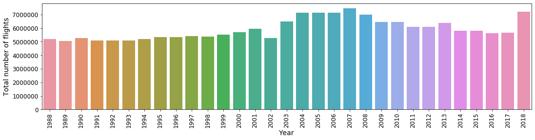 Fig. 2: Number of flights per year
We see that the number of flights steadily rises in the late 1980s and throughout the 1990s, peaking during mid 2000s. The sudden drop in 2002 is due to the new security regulations that were established following the tragedy of 2001. A drop-off follows in the 2010s, with a sudden resurgence in the number of flights in 2018.
One can take a similar approach to determine the most common origins and destinations in the United States. The top 11 most common origin and destination airports over the last 30 years are shown in Figure 3. The two panels are nearly identical which makes sense — number of outgoing flights should match the number of incoming flights. The Atlanta International Airport (ATL) has seen the most traffic, followed by O’Hare International Airport (ORD) and the Dallas/Fort Worth International Airport (DFW).
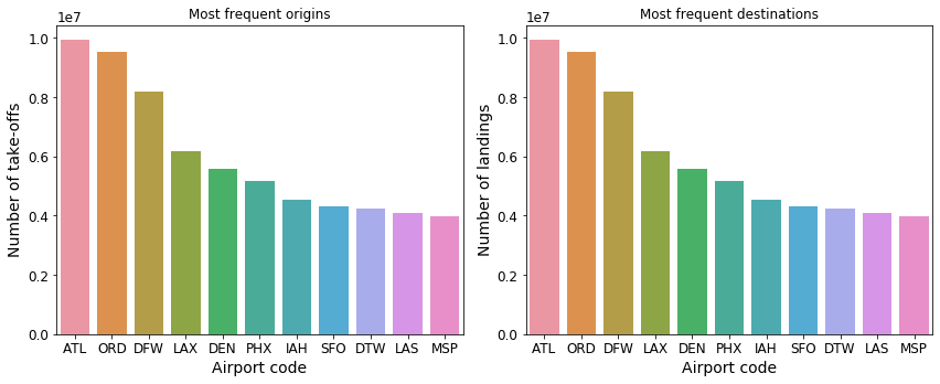 Fig. 3: Top 11 most common origins and destinations
Next, let us find the popular take-off dates and times. With Vaex, this is surprisingly easy:
# to make it start from 0
df_filtered['Month'] = df_filtered.Month - 1
df_filtered['DayOfWeek'] = df_filtered.DayOfWeek - 1

# label them as categories
df_filtered.categorize(column='Month')
df_filtered.categorize(column='DayOfWeek')

# Plot the data
df_filtered.plot('Month', 'DayOfWeek', colorbar=True, figsize=(15, 5))
First we subtract -1 from the Month and DayOfWeek columns to make them start from 0. Since these columns contain discrete integers, we mark them as “categorical”. Finally we can use the plot method to visualize a nice 2-dimensional histogram of the number of take-offs for a particular day and month. Typically, the plot method produces a 2-dimensional histogram of continuous data given certain grid resolution and boundaries. However, since the columns being plotted are marked as categorical, the method will automatically set the bins and count the discrete values for each day/month combination. The result is the following figure:
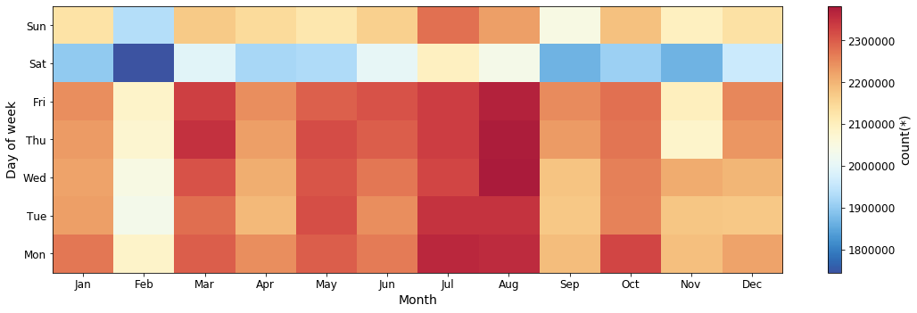 Fig. 4: Number of flights per month vs day of the week.
It seems that July and August are the most popular months for travelling by aeroplane, while in February there is the least amount of air traffic. The fewest number of take-offs happen on Saturdays, and the February Saturdays see by far the fewest departures.
Similarly, we can also explore the number of departures for any given hour per day of week:
# Extract the hour from the time column
df_filtered['CRSDepHour'] = df_filtered.CRSDepTime // 100 % 24
# Treat as a categorical
df_filtered.categorize(column='CRSDepHour')
# Plot the data
df_filtered.plot('CRSDepHour', 'DayOfWeek', figsize=(15, 5))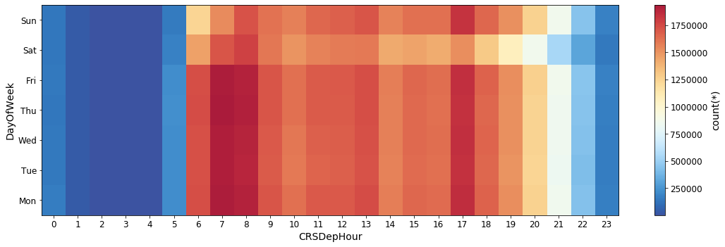 Fig. 5: Number of departures per hour vs day of week.
The time period between 6 and 9 o’clock in the morning sees the most departures, with another peak occurring at 5pm. There are significantly less flights over night (10pm — 5am) compared to the day time hours. Less take-offs happen over the weekend compared to the weekdays, as it was already apparent in Figure 3.
Now let us turn our attention to some of the basic properties of the flights themselves. Let’s plot the air-time, distance and speed distributions:
p.figure(figsize=(18, 5))
p.subplot(131)
df_filtered.plot1d('AirTime', limits=[0, 500], lw=3, shape=64)
p.xlabel('AirTime [min]')
p.subplot(132)
df_filtered.plot1d('Distance', limits='minmax', lw=3, shape=64)
p.xlabel('Distance [miles]')
p.subplot(133)
# Calculate the mean speed of the aircraft
df_filtered['Speed'] = df_filtered.Distance / (df_filtered.AirTime/60.) # this is in miles per hour
df.plot1d('Speed', limits=[100, 700], lw=3, shape=64)
p.xlabel('Speed [miles/hour]')
p.tight_layout()
p.show()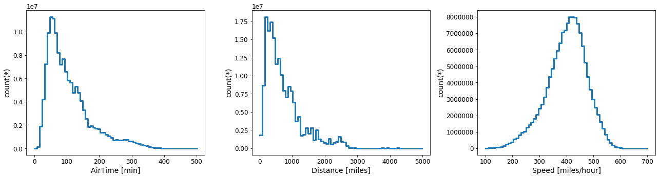 Fig. 6: Distributions of the air-time(left), distance (middle) and average speed(right) for each flight.
Looking at Figure 5, I got curious: which are the shortest and longest distance regular routes. So let’s check that out. To find out the frequent flights that operate on short distances, lets count the number of flights for any given distance below, say 20 miles:
df_filtered[df_filtered.Distance <= 20].Distance.value_counts()
 11    2710
 17      46
 18       5
 16       3
 12       2
 10       2
 19       1
 8        1
 6        1
 dtype: int64
It looks like that there are nearly 3000 flights that have happened between two airports of just 11 miles apart! Applying the value_counts method on the Origin column for the same filter as in the code-block above, tells us what the routes are: San Francisco International — Oakland International with over 2600 flights in the last 30 years, and John F. Kennedy International — LaGuardia Airport with just a handful of flights over the same time period. Let us look at this in a bit more detail, and count the number of flights per year between these two airport pairs:
nf_sfo_oak = df_filtered[(df_filtered.Distance == 11.) & ((df_filtered.Origin=='SFO') | (df_filtered.Origin == 'OAK'))]['Year'].value_counts()
nf_jfk_lga = df_filtered[(df_filtered.Distance == 11.) & ((df_filtered.Origin=='JFK') | (df_filtered.Origin == 'LGA'))]['Year'].value_counts()
fig, (ax1, ax2) = plt.subplots(nrows=1, ncols=2)
fig.set_size_inches(16, 4)
sns.barplot(nf_sfo_oak.index, nf_sfo_oak.values, ax=ax1)
sns.barplot(nf_jfk_lga.index, nf_jfk_lga.values, ax=ax2)
plt.tight_layout()
plt.show()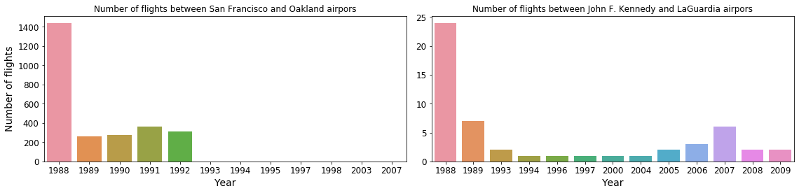 Fig. 7: Number of flights per year on the shortest routes over the past 30 years.
From the left panel on above figure we can see that a regular airline route between the San Francisco International and Oakland International airports existed for at least for 5 years. At a distance of only 11 miles as the crow files, that is just crazy. According to Google Maps, one can drive between these two airports in a bit over 30 minutes. In fact from the number of flights, we can deduce that on average there were almost 4 flights per day between these two airports in 1988, reducing to roughly a single flight per day in the subsequent 4 years. Starting from 1993, only a handful of flights have been registered. On the other hand, only 53 flights have been recorded between John F. Kennedy International and LaGuardia airports over the last 30 years, most likely private flights or special services.
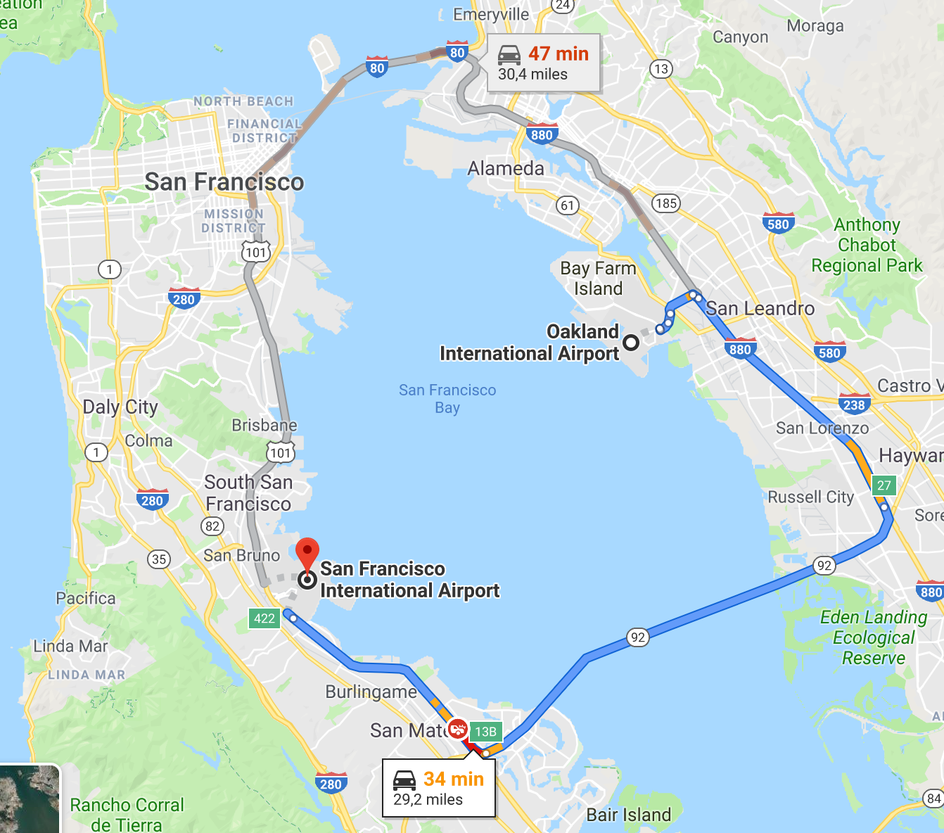 Fig. 8: Google Maps screen-shot showing the proximity between San Francisco and Oakland airports.
To determine the longest regular route we can do a similar exercise. By looking at the middle panel of Figure 5, let us count the number of flights that traverse more than 4900 miles:
df_filtered[df_filtered.Distance > 4900].Distance.value_counts()
4962    13045
4983     4863
4963     2070
dtype: int64
Looks like there are 3 regular sets of fixed distances, indicating at least 3 airport pairs. Note that two of these distance sets are different only by a single mile. To determine which are the airports in question, we can group by data based on the flights Origin, Destination and Distance, after it has been filtered to select only extremely large distances:
df_filtered[df_filtered.Distance > 4900].groupby(by=['Origin', 'Dest', 'Distance'],
                                                 agg={'Origin':'count'})
# Origin  Dest    Distance  count
0    HNL   JFK        4983   2432
1    HNL   EWR        4962   6528
2    HNL   EWR        4963   1035
3    EWR   HNL        4962   6517
4    EWR   HNL        4963   1035
5    JFK   HNL        4983   2431
The result of the groupby operation tells us that in fact there are only two routes: Newark Liberty International (EWR) and John F. Kennedy International (JFK) airports both flying to and from Honolulu International (HNL). The flight distance between Honolulu International and Newark Liberty International airports should be exactly 4962 miles if the standard route is followed. However, due to the tragedy in 2001, the route was altered temporarily for a few years, which is why we observe two nearly identical flight distances between the same airports. Let’s see the number of flights per year between these two airports:
nf_ewr_nhl = df_filtered[(df_filtered.Distance == 4962) | (df_filtered.Distance == 4963)]['Year'].value_counts()
sns.barplot(nf_ewr_nhl.index, nf_ewr_nhl.values)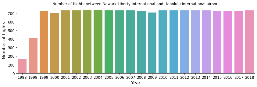 Fig. 9: Number of flights between Honolulu International and Newark Liberty International airports.
The above figure shows a near constant service with on average two flights per day between Newark Liberty International and Honolulu International starting from 1999. The other long-distance regular line is between Honolulu International and John F. Kennedy International. Similarly as before, we can plot the number of flights that happen per year, shown below. A frequent service started in 2012, with on average of a single flight per day. From 2013 going forward, there are on average 2 flights per day between these two airports.
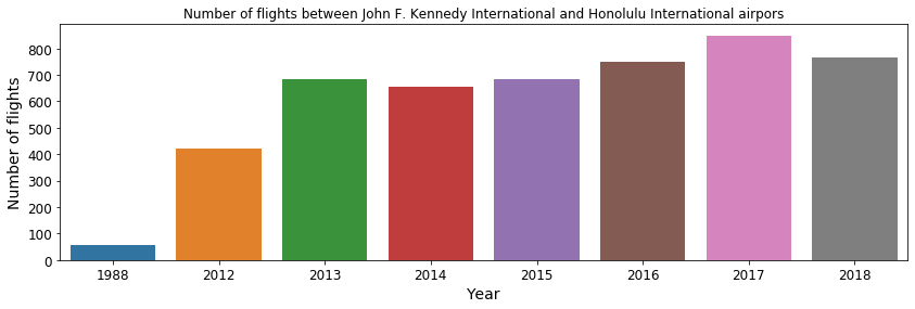 Fig. 10: Number of flights between Honolulu International and John F. Kennedy International airports.
Let’s get more focused
The dataset we are analysing features not only the larger commuting hubs that we may initially think of, but also many much less frequently used local airports, along with cargo, sport, and military airports. In fact, out of the 441 airports present in the data, the 10 most frequent account for 33%, while the 50 most frequent account for 80% of all departures in our dataset. Thus, in the subsequent analysis I will consider only the large-ish commercial airports. The “rule of thumb” for an airport to enter this selection is to have over 200 thousand departures over the last 30 years. The rationale is that such an airport should have at ~20 regular destinations with 1 flight per day. To do such a selection, we will group the flights based on their point of origin, and then count the number of flights in each group. Since we are already doing a groupby operation, we can calculate additional aggregate statistics such as the mean taxi times, distance flown and flight delay:
df_group_by_origin = df_filtered.groupby(by='Origin', agg={'Year': 'count', 'Distance': ['mean', 'std'],                                                            'TaxiIn': ['mean', 'std'],                                 'TaxiOut': ['mean', 'std'],                                                            'DepDelay': ['mean', 'std']})
df_group_by_origin = df_group_by_origin[(df_group_by_origin['count'] > 200_000)]
Form this group DataFrame, we can get some interesting insights. For instance, let’s check the 10 airports with the longest average reach, i.e. the airports from which the departing flights on average fly the largest distances:
df_group_by_origin.sort(by='Distance_mean', ascending=False).head(10)We find that these are airports that are either located in remote parts of the U.S., like the Hawaii Islands (HNL, OGG), Puerto Rico (SJU), Alaska (ANC), or airports attached to the larger cities along the coasts of the mainland (San Francisco, Los Angeles, New York, Miami). In fact, if we take the median of the average distance among flights originating for each airport, we get a value of 600 miles. This value represent the typical distance between big cities or popular destinations that contain a frequently used commercial airport.
We can also investigate the taxi-in and and taxi-out times for each airport, which are the times the aircraft spends in movement or on hold prior to take-off and after landing respectively, while all the passengers are still on-board. This can give us insights on how “busy” an airport is, or how efficiently it is run. Let’s plot the distributions of mean taxi times for the airports:
plt.figure(figsize=(8, 4))
df_group_by_origin.plot1d('TaxiIn_mean', limits=[0, 30], lw=2, shape=64, label='Taxi-in')
df_group_by_origin.plot1d('TaxiOut_mean', limits=[0, 30], lw=2, shape=64, label='Taxi-out')
plt.xlabel('Taxi [min]')
plt.legend()
plt.show()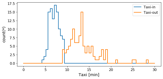 Fig. 11: Average taxi times for the main airports
On average a plane spends 5–10 minutes longer taxing prior to take-off than it does after landing. For some airports the taxi-out times can last over 20 minutes on average. The longest waiting time prior to take-off happens at John F. Kennedy with a average taxi-out time of 28 minutes! The Lubbock International airport is the best in this regard, with an average taxi-out time of just over 8 minutes.
Delays and cancellations
Now let us do something more interesting, and look at the flight delays and cancellations. Since we only want to consider the most frequently used airports, we can do an inner join between the primary DataFrame we used for this analysis df_filtered and the df_group_by_origin DataFrame from which we filtered out the airports with less than 200 thousand departures:
df_top_origins = df_filtered.join(other=df_group_by_origin,
                                  on='Origin',
                                  how='inner',
                                  rsuffix='_')
To mark whether a flight has been delayed, we can add a virtual column:
df_top_origins['Delayed'] = (df_top_origins.DepDelay > 0).astype('int')Recall that this does not take any memory, but just a mathematical expression stored in the DataFrame, which is evaluated only when necessary. A similar column but for cancelled flights already exists in the dataset. Let’s see the number of delays and cancellations per year:
df_group_by_year = df_top_origins.groupby(by='Year',
agg={'Year': 'count',
'Distance': ['mean', 'std'],
'TaxiIn': ['mean', 'std'],
'TaxiOut': ['mean', 'std'],
'DepDelay': ['mean', 'std', 'sum'],
'Cancelled': ['sum'],
'Delayed': ['sum'],
'Diverted': ['sum']})
sns.barplot(x=df_group_by_year.Year.values, y=df_group_by_year.Delayed_sum.values)
sns.barplot(x=df_group_by_year.Year.values, y=df_group_by_year.Cancelled_sum.values)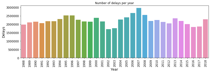 Fig. 14: Number of delays per year
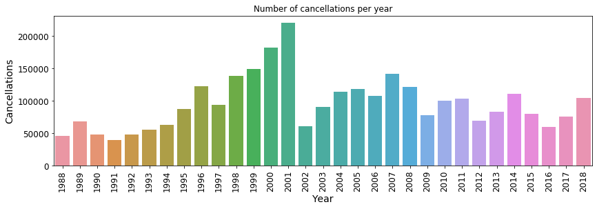 Fig. 15: Number of cancellations per year
Since 2003, the database also contains the reason for the flight cancellation, if known. Thus, we can create a plot showing the number of cancellation per year per cancellation code, i.e. the reason for the flights being cancelled. The seaborn library is especially useful for such visualizations:
# The cancellation code was introduced in the database after 2002, hence the filtering
df_year_cancel = df_top_origins[df_top_origins.Year > 2002].groupby(by=['Year', 'CancellationCode'],
agg={'Cancelled': ['sum']})
# Keep only the portion of the DataFrame that contains a proper cancellation code:
df_year_cancel = df_year_cancel[~((df_year_cancel.CancellationCode == '') | (df_year_cancel.CancellationCode == 'null') )]
# Map the cancellation codes to a verbose description
canc_code_mapper = {'A': 'carrier',
'B': 'weather',
'C': 'National Airspace System',
'D': 'Security'}
df_year_cancel['CancellationCode_'] = df_year_cancel.CancellationCode.map(canc_code_mapper, allow_missing=False)
sns.barplot(x='Year',
y='Cancelled_sum',
hue='CancellationCode_',
data=df_year_cancel.to_pandas_df(virtual=True),
palette=sns.color_palette(['C0', 'C1', 'C2', 'C3', 'C6']))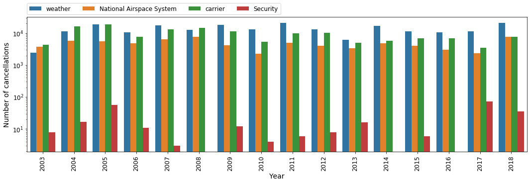 Fig. 16: The reason behind flight cancellations per year, if known.
It is a bit alarming to see that the number of cancellations due to security reasons has gone up recently. Hopefully this is just relative peak, and such cancellations will be much less frequent in the future. Now let us see at which airports are flights most commonly delayed or cancelled:
# Group by Origin and the number of Delayed and Cancelled flights
df_group_by_origin_cancel = df_top_origins.groupby(by='Origin').agg({'Delayed': ['count', 'sum'],
                                                                     'Cancelled': ['sum']})
# Calculate the percentage of delayed and cancelled flights
df_group_by_origin_cancel['delayed_perc'] = df_group_by_origin_cancel.Delayed_sum/df_group_by_origin_cancel['count'] * 100.
df_group_by_origin_cancel['cancelled_perc'] = df_group_by_origin_cancel.Cancelled_sum/df_group_by_origin_cancel['count'] * 100.

sns.barplot(df_group_by_origin_cancel.sort(by='delayed_perc', ascending=False)['Origin'].tolist()[:11],
            df_group_by_origin_cancel.sort(by='delayed_perc', ascending=False)['delayed_perc'].tolist()[:11])
sns.barplot(df_group_by_origin_cancel.sort(by='cancelled_perc', ascending=False)['Origin'].tolist()[:11],
            df_group_by_origin_cancel.sort(by='cancelled_perc', ascending=False)['cancelled_perc'].tolist()[:11])
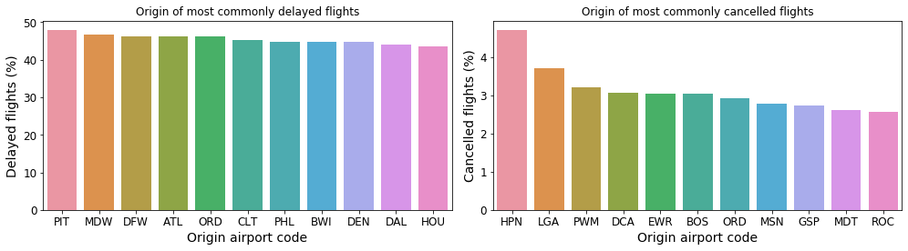 Fig. 17: Airports at which outgoing flights experience the most delays (left) and cancellations (right).
At Pittsburgh International (PIT) airport over 45% of all outgoing flights experience some kind of delay! Chicago Midway International (MDW) and Dallas International (DFW) are not far behind on this unflattering list. Westchester County Airport (HPN), LaGuardia Airport (LGA) and Portland International Jetport (PWM) are the top 3 airports with the largest percentage of cancelled flights.
Now let’s start pointing fingers and see which airline carriers experience the most delays and cancellations, regardless of the point of origin. The dataset we are using already contains a column with the code for the main carrier of each flight. To attach the actual airline name to this code, we can use the table found here. Note that is has been a while since this table was compiled, so it may be a bit out of date. Still let us map the actual airline names to the airline codes present in our dataset:
# Load the carrier name data
aux_df_carrers = vaex.from_csv('./data/aux-carriers.csv', copy_index=False)
# Create a dict that translates from carrier codes to proper names
mapper_carriers = dict(zip(aux_df_carrers.Code.values, aux_df_carrers.Description.values))
# Create a dict that translates from carrier codes to proper names
df_group_by_carrier_cancel['CarrierName'] = df_group_by_carrier_cancel.UniqueCarrier.map(mapper=mapper_carriers)
# Shorten carrier names for the plots to look better
df_group_by_carrier_cancel['CarrierName_short'] = df_group_by_carrier_cancel.CarrierName.str.slice(start=0, stop=23)
sns.barplot(df_group_by_carrier_cancel.sort(by='delayed_perc', ascending=False)['delayed_perc'].tolist()[:11],
df_group_by_carrier_cancel.sort(by='delayed_perc', ascending=False)['CarrierName_short'].tolist()[:11])
sns.barplot(df_group_by_carrier_cancel.sort(by='cancelled_perc', ascending=False)['cancelled_perc'].tolist()[:11],
df_group_by_carrier_cancel.sort(by='cancelled_perc', ascending=False)['CarrierName_short'].tolist()[:11])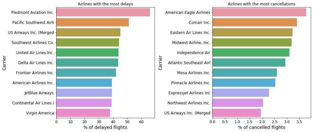 Fig. 18: Airline carriers which experience the most delays (left) and cancellations (right).
I hope you do not see your favourite airline in the figure above! It is quite incredible that there are carriers whose flights are delayed more than 50% of the time. But enough of pointing fingers. Let us check out the other end of the spectrum and see which airlines experience the fewest delays and cancellations:
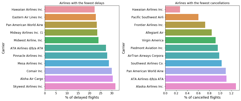 Fig. 19: Airline carriers which experience the fewest delays (left) and cancellations (right).
The carriers with the fewest cancellations are those that typically operate at long distances, like the Hawaiian airlines or those that fly around the Pacific. This makes sense: there is not much “traffic jam” happening on those airports, and these flights are usually very long distance, and less frequent, and are thus likely given a higher priority.
More connected than ever
Finally, let us see how the number of connections between different airports changed over time. Let’s calculate the mean number of unique connections each of the frequently used airports is connected to, and plot this per year:
# Aggregate the number of unique destination for each origin for each year
tmp_group = df_top_origins.groupby(by=['Year', 'Origin'], agg={'Year': 'count',
'Dest': [vaex.agg.nunique(df_top_origins.Dest, dropna=True)]})
# Calculate the mean number of destinations for all origins per year
df_mean_num_dest = tmp_group.groupby('Year').agg({'Dest_nunique': ['mean']})
sns.barplot(x=df_mean_num_dest.Year.values, y=df_mean_num_dest.Dest_nunique_mean.values)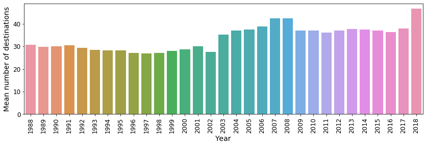 Fig. 20: The mean number of unique destinations that can be reached from each airport.
From the above figure we can see that after several years of “stagnation”, in 2018 U.S. airports are more connected than ever.
Thank you for flying with us
The U.S. flight data is a very interesting dataset. It offers many angles from which these data can be analysed, much more than what is described in this article. Also check out the full notebook, as it contains more details on how the above plots were created, plus some additional insights.
I hope that this inspires you to dig deeper into this, or even larger datasets, especially now that you know how easy it is to do so with Vaex. In fact, I would consider this dataset on the small side at least as far as Vaex is concerned. Vaex is free and open-source, and I would encourage you to try it out in your work-flow, especially if you are running into memory issues.
Happy data sciencing!