
Many organizations are trying to gather and utilise as much data as possible to improve on how they run their business, increase revenue, or how they impact the world around them. Therefore it is becoming increasingly common for data scientists to face 50GB or even 500GB sized datasets.
Now, these kind of datasets are a bit… uncomfortable to use. They are small enough to fit into the hard-drive of your everyday laptop, but way to big to fit in RAM. Thus, they are already tricky to open and inspect, let alone to explore or analyse.
There are 3 strategies commonly employed when working with such datasets. The first one is to sub-sample the data. The drawback here is obvious: one may miss key insights by not looking at the relevant portions, or even worse, misinterpret the story the data it telling by not looking at all of it. The next strategy is to use distributed computing. While this is a valid approach for some cases, it comes with the significant overhead of managing and maintaining a cluster. Imagine having to set up a cluster for a dataset that is just out of RAM reach, like in the 30–50 GB range. It seems like an overkill to me. Alternatively, one can rent a single strong cloud instance with as much memory as required to work with the data in question. For example, AWS offers instances with Terabytes of RAM. In this case you still have to manage cloud data buckets, wait for data transfer from bucket to instance every time the instance starts, handle compliance issues that come with putting data on the cloud, and deal with all the inconvenience that come with working on a remote machine. Not to mention the costs, which although start low, tend to pile up as time goes on.
In this article I will show you a new approach: a faster, more secure, and just overall more convenient way to do data science using data of almost arbitrary size, as long as it can fit on the hard-drive of your laptop, desktop or server.
Vaex
Vaex is an open-source DataFrame library which enables the visualisation, exploration, analysis and even machine learning on tabular datasets that are as large as your hard-drive. To do this, Vaex employs concepts such as memory mapping, efficient out-of-core algorithms and lazy evaluations. All of this is wrapped in a familiar Pandas-like API, so anyone can get started right away.

The Billion Taxi Rides Analysis
To illustrate this concepts, let us do a simple exploratory data analysis on a dataset that is far to large to fit into RAM of a typical laptop. In this article we will use the New York City (NYC) Taxi dataset, which contains information on over 1 billion taxi trips conducted between 2009 and 2015 by the iconic Yellow Taxis. The data can be downloaded from this website, and comes in CSV format. The complete analysis can be viewed separately in this Jupyter notebook.
Cleaning the streets
The first step is to convert the data into a memory mappable file format, such as Apache Arrow, Apache Parquet, or HDF5. An example of how to do convert CSV data to HDF5 can be found in here. Once the data is in a memory mappable format, opening it with Vaex is instant (0.052 seconds!), despite its size of over 100GB on disk:
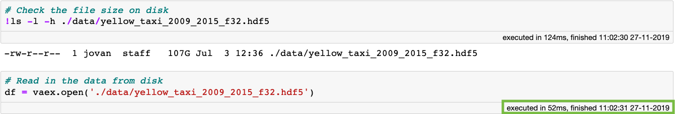 Opening memory mapped files with Vaex is instant (0.052 seconds!), even if they are over 100GB large.
Why is it so fast? When you open a memory mapped file with Vaex, there is actually no data reading going on. Vaex only reads the file metadata, such as the location of the data on disk, the data structure (number of rows, number of columns, column names and types), the file description and so on. So what if we want to inspect or interact with the data? Opening a dataset results in a standard DataFrame and inspecting it is as fast as it is trivial:
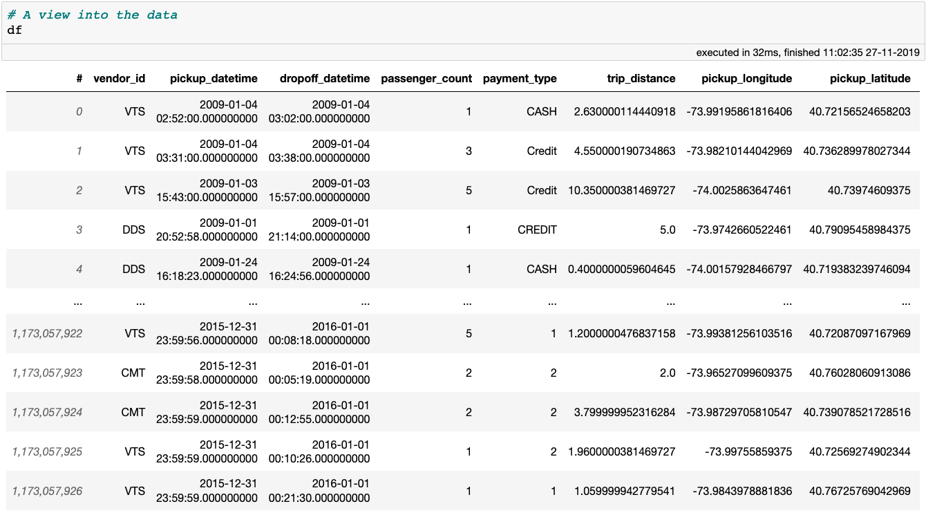 A preview of the New York City Yellow Taxi data
Once again, notice that the cell execution time is crazy short. This is because displaying a Vaex DataFrame or column requires only the first and last 5 rows to be read from disk. This leads us to another important point: Vaex will only go over the entire dataset when it has to, and it will try to do it with as few passes over the data as possible.
Anyway, let’s begin by cleaning this dataset from extreme outliers, or erroneous data inputs. A good way to start is to get a high level overview of the data using the describe method, which shows the number of samples, the number of missing values and the data type for each column. If the data type of a column is numerical, the mean, standard deviation, as well as the minimum and maximum values will also be shown. All of these stats are computed with a single pass over the data.
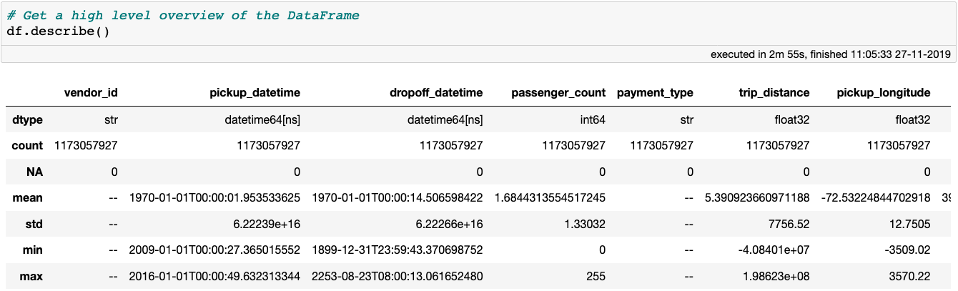 Getting a high level overview of a DataFrame with the
 describe method. Note that the DataFrame contains 18 column, but only the first 7 are visible on this screenshot.
The describe method nicely illustrates the power and efficiency of Vaex: all of these statistics were computed in under 3 minutes on my MacBook Pro (15", 2018, 2.6GHz Intel Core i7, 32GB RAM). Other libraries or methods would require either distributed computing or a cloud instance with over 100GB to preform the same computations. With Vaex, all you need is the data, and your laptop with only a few GB of RAM to spare.
Looking at the output of describe, it is easy to notice that the data contains some serious outliers. First, let’s start by examining the pick-up locations. Easiest way to remove outliers is to simply plot the pick-up and drop-off locations, and visually define the area of NYC on which we want to focus our analysis. Since we are working with such a large dataset, histograms are the most effective visualisations. Creating and displaying histograms and heatmaps with Vaex is so fast, such plots can be made interactive!
df.plot_widget(df.pickup_longitude,
               df.pickup_latitude,
               shape=512,
               limits='minmax',
               f='log1p',
               colormap='plasma')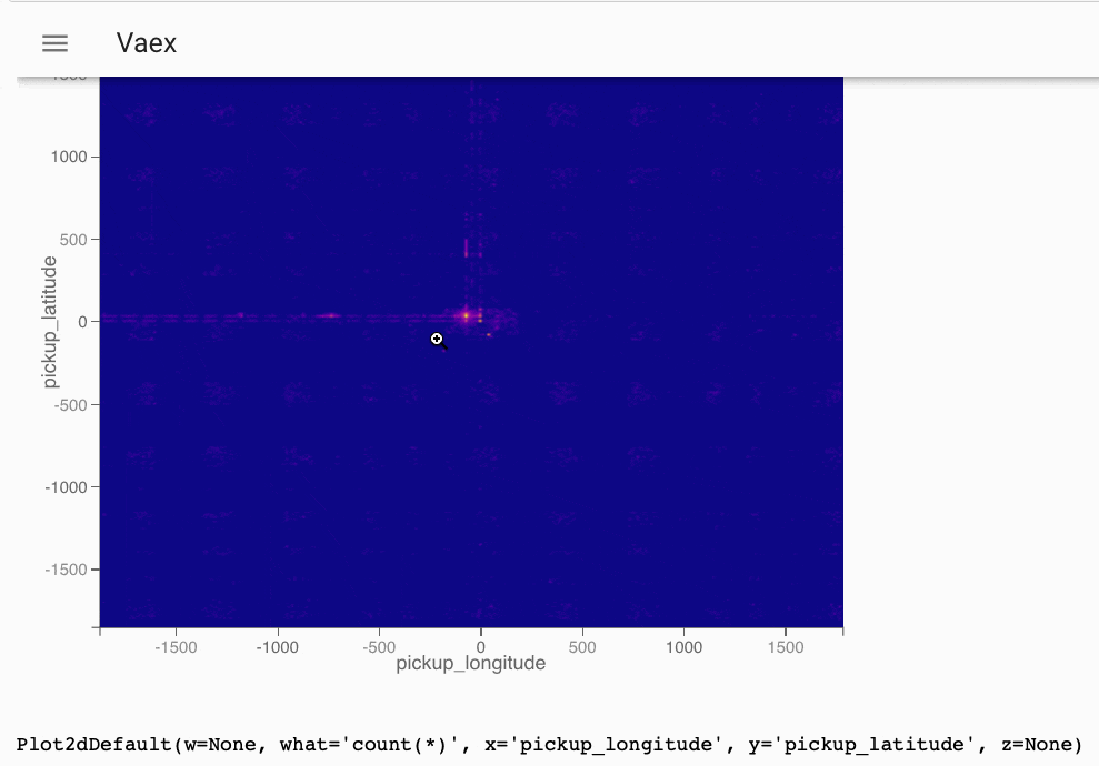
Once we interactively decide on which area of NYC we want to focus, we can simply create a filtered DataFrame:
The cool thing about the code block above is that it requires negligible amount of memory to execute! When filtering a Vaex DataFrame no copies of the data are made. Instead only a reference to the original object is created, on which a binary mask is applied. The mask selects which rows are displayed and used for future calculations. This saves us 100GB of RAM that would be needed if the data were to be copied, as done by many of the standard data science tools today.
Now, let’s examine the passenger_count column. The maximum number of passengers recorded in a single taxi trip is 255, which seems a little extreme. Let’s count the number of trips per number of passengers. This is easily done with the value_counts method:
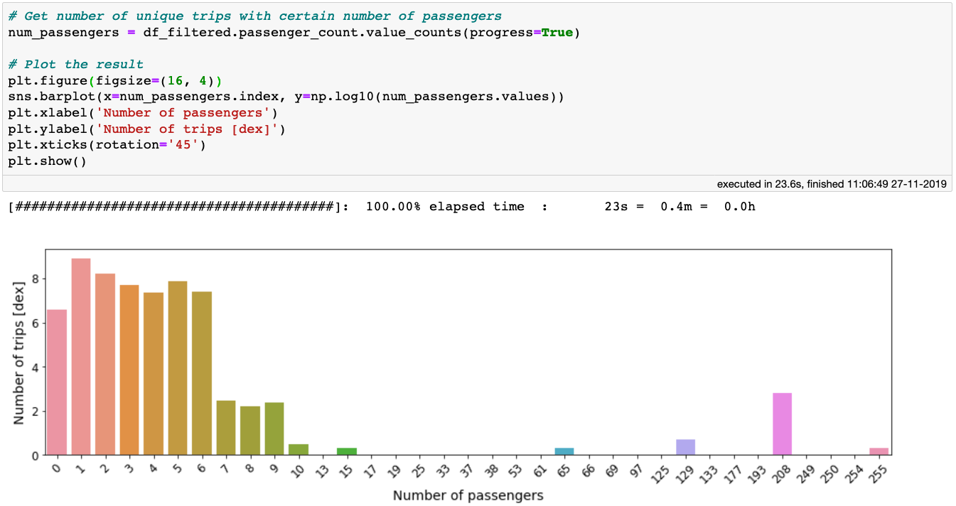 The
The value_counts method applied on 1 billion rows takes only ~20 seconds!
From the above figure we can see that trips with more than 6 passengers are likely to be either rare outliers or just erroneous data inputs. There is also a large number of trips with 0 passengers. Since at this time we do not understand whether these are legitimate trips, let us filter them out as well.

Let’s do a similar exercise with the trip distance. As this is a continuous variable, we can plot the distribution of trip distances. Looking at the minimum (negative!) and maximum (further than Mars!) distance, let’s plot a histogram with a more sensible range.
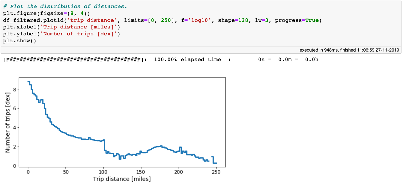 A histogram of the trip distances for the NYC taxi dataset.
From the plot above we can see that number of trips decreases with increasing distance. At a distance of ~100 miles, there is a large drop in the distribution. For now, we will use this as the cut-off point to eliminate extreme outliers based on the trip distance:

The presence of extreme outliers in the trip distance columns serves as motivation to investigate the trip durations and average speed of the taxis. These features are not readily available in the dataset, but are trivial to compute:
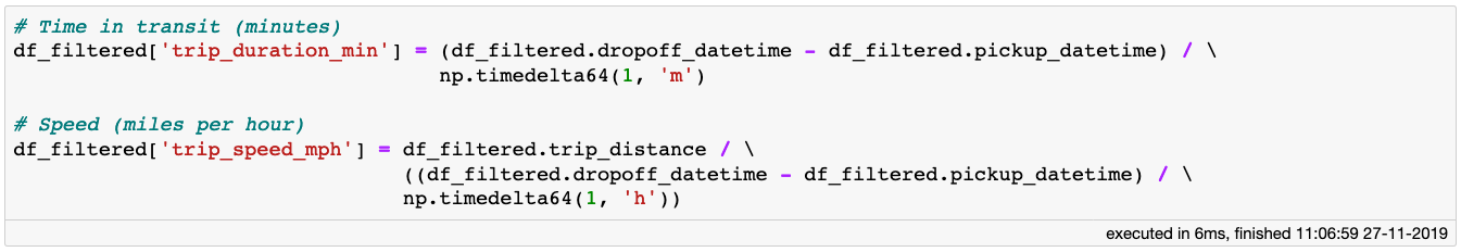
The code block above requires zero memory and takes no time to execute! This is because the code results in the creation of virtual columns. These columns just house the mathematical expressions, and are evaluated only when required. Otherwise, virtual columns behave just as any other regular column. Note that other standard libraries would require 10s of GB of RAM for the same operations.
Alright, so let’s plot the distribution of trip durations:
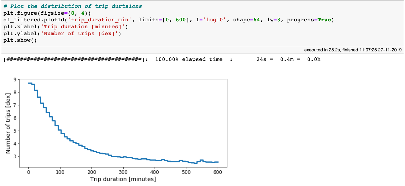 Histogram of durations of over 1 billion taxi trips in NYC.
From the above plot we see that 95% of all taxi trips take less than 30 minutes to reach their destination, although some trips can take more then 4–5 hours. Can you imagine being stuck in a taxi for over 3 hours in New York City? Anyway, let’s be open minded and consider all trips that last less than 3 hours in total:

Now let’s investigate the mean speed of the taxis, while also choosing a sensible range for the data limits:
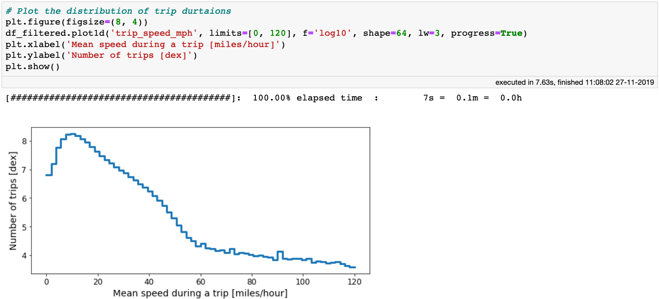 The distribution of average taxi speed.
Based on where the distribution flattens out, we can deduce that a sensible average taxi speed is in the range between 1 and 60 miles per hour, and thus we can update our filtered DataFrame:

Lets shift the focus to the cost of the taxi trips. From the output of the describe method, we can see that there are some crazy outliers in the fare_amount, total_amount, and tip_amount columns. For starters, no value in any of these columns should be negative. On the opposite side of the spectrum, the numbers suggest that some lucky driver almost became a millionaire with a single taxi ride. Let’s look at the distributions of these quantities, but in a relatively sensible range:
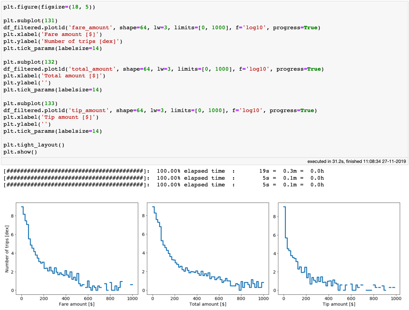 The distributions of the fare, total and tip amounts for over 1 billion taxi trips in NYC. The creation of these plots took only 31 seconds on a laptop!
We see that all three of the above distributions have rather long tails. It is possible that some values in the tails are legit, while others are perhaps erroneous data inputs. In any case, let’s be conservative for now and consider only rides that had fare_amount, total_amount, and tip_amount less than $200. We also require that the fare_amount, total_amount values be larger than $0.
Finally, after all initial cleaning of the data, let’s see how many taxi trips are left for our analysis:

We are left with over 1.1 billion trips! That is plenty of data to get some valuable insights into the world of taxi travel.
Into the drivers seat
Assume we are a prospective taxi driver, or a manager of a taxi company, and are interested in using this dataset to learn how to maximize our profits, minimize our costs, or simply just improve our work life.
Let’s start by finding out the locations for picking up passengers that, on average, would lead to the best earnings. Naively, we can just plot a heatmap of the pick-up locations colour-coded by the average fare amount, and look at the hotspots. Taxi drivers have costs on their own, however. For example, they have to pay for fuel. Hence, taking a passenger somewhere far away might result in a larger fare amount, but it would also mean larger fuel consumption, and time lost. In addition, it may not be that easy to find a passenger from that remote location to fare somewhere to the city centre, and thus driving back without a passenger might be costly. One way to account for this is to colour-code a heatmap by the mean of the ratio between the fare amount and trip distance. Let’s consider these two approaches:
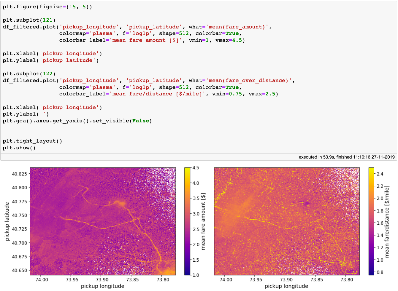 Heatmaps of NYC colour-coded by: average fare amount (left), and average ratio of fare amount over trip distance.
In the naive case, when we just care about getting a maximum fare for the service provided, the best regions to pick up passengers from are the NYC airports, and along the main avenues such as the Van Wyck Expressway, and the Long Island Expressway. When we take the distance travelled into account, we get a slightly different picture. The Van Wyck Expressway, and the Long Island Expressway avenues, as well as the airports are still a good place for picking up passengers, but they are a lot less prominent on the map. However, some bright new hotspots appear on the west side of the Hudson river that seem quite profitable.
Being a taxi driver can be quite a flexible job. To better leverage that flexibility it would be useful to know when driving is most profitable, in addition to where one should be lurking. To answer this question, let’s produce a plot showing the mean ratio of fare over trip distance for every day and hour of the day:
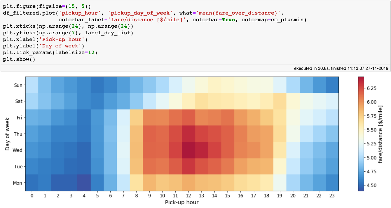 The mean ratio of fare over trip distance per day of week and hour of day.
The figure above makes sense: the best earnings happen during rush-hour, especially around noon, during the working days of the week. As a taxi driver, a fraction of our earnings go to the taxi company, so we might be interested in which day and at which times customers tip the most. So let’s produce a similar plot, this time displaying the mean tip percentage:
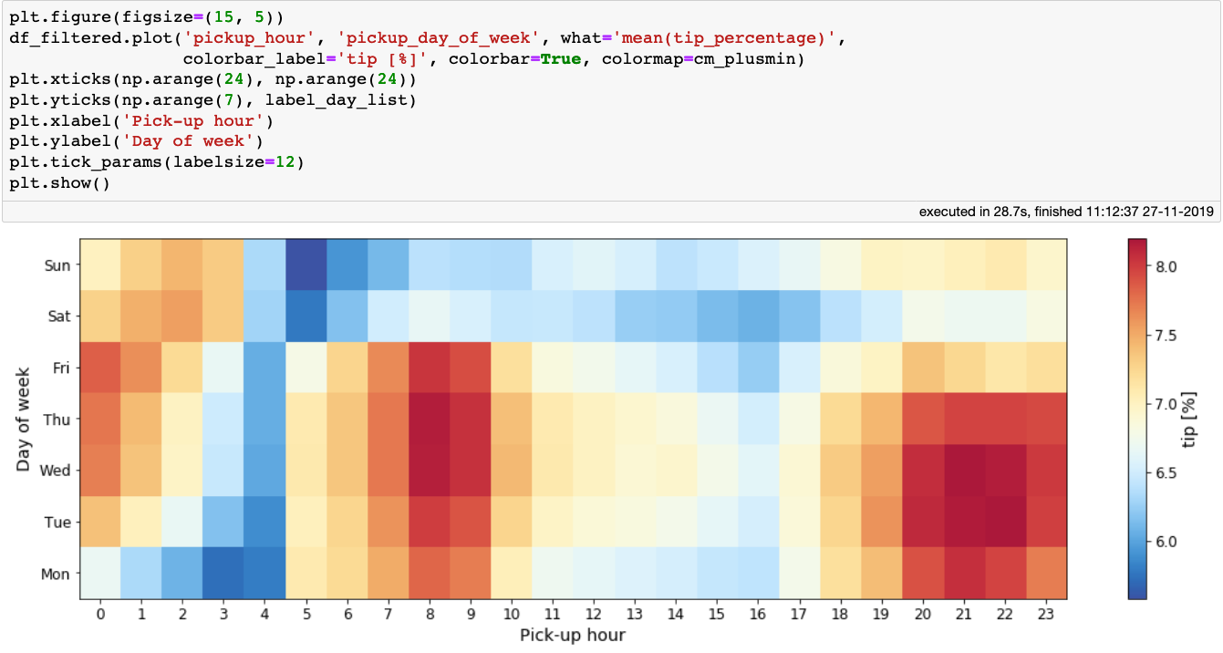 The mean tip percentage per day of week and hour of day.
The above plot is interesting. It tells us that passengers tip their taxi drivers the most between 7–10 o’clock in the morning, and in the evening in the early part of the week. Do not expect large tips if you pick up passengers at 3 or 4am. Combining the insights from the last two plots, a nice time to work is 8–10 o’clock in the morning: one would get both a good fare per mile, and a good tip.
Rev your engine!
In the earlier part of this article we briefly focused on the trip_distance column, and while cleaning it from outliers we kept all trips with a value lower than 100 miles. That is still a rather large cut-off value, especially given that the Yellow Taxi company operates primarily over Manhattan. The *trip_distance *column describes the distance the taxi travelled between the pick-up and the drop-off location. However, one can often take different routes with different distances between two exact pick-up and drop-off locations, for example to avoid traffic jams or roadworks. Thus as a counterpart to the *trip_distance *column, let’s calculate the shortest possible distance between a pick-up and drop-off locations, which we call arc_distance:
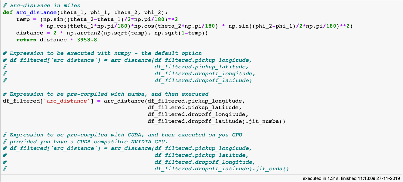 For complicated expressions written in numpy, vaex can use just-in-time compilation with the help of Numba, Pythran or even CUDA (if you have a NVIDIA GPU) to greatly speed up your computations.
The formula for the arc_distance calculation is quite involved, it contains much trigonometry and arithmetic, and can be computationally expensive especially when we are working with large datasets. If the expression or function is written only using Python operations and methods from the Numpy package, Vaex will compute it in parallel using all the cores of your machine. In addition to this, Vaex supports Just-In-Time compilation via Numba (using LLVM) or Pythran (acceleration via C++), giving better performance. If you happen to have a NVIDIA graphics card, you can use CUDA via the jit_cuda method to get even faster performance.
Anyway, let’s plot the distributions of trip_distance and arc_distance:
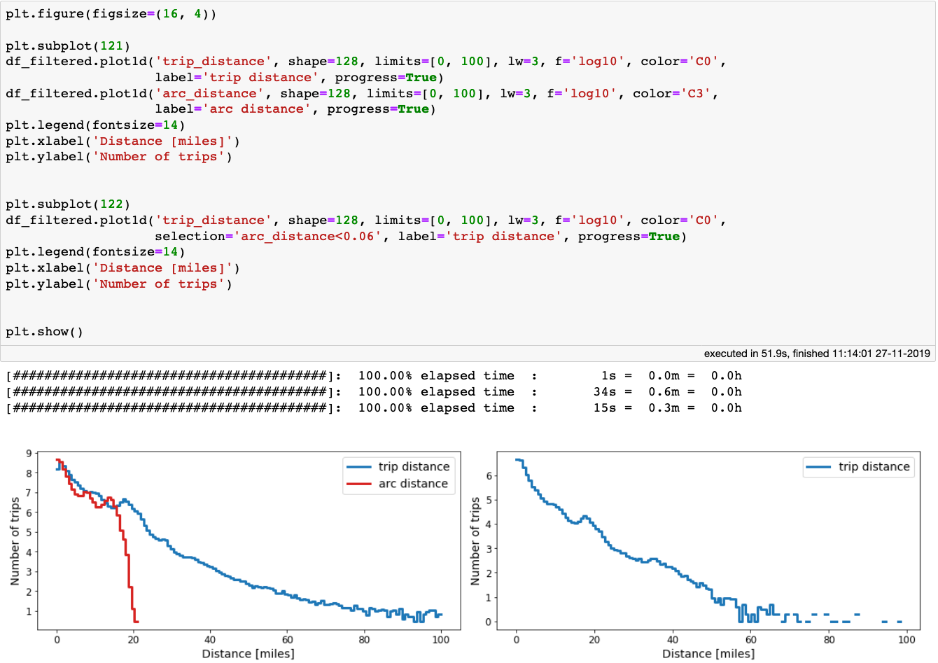 Left: comparison between trip_distance and arc_distance. Right: the distribution of trip_distance for arc_distance<100 meters.
It is interesting to see that the arc_distance never exceeds 21 miles, but the distance the taxi actually travelled can be 5 times as large. In fact, there are millions of taxi trips for which the drop-off location was within 100 meters (0.06 miles) from the pickup-location!
Yellow Taxis over the years
The dataset that we are using today spans across 7 years. It can be interesting to see how some quantities of interest evolved over that time. With Vaex, we can do fast out-of-core group-by and aggregation operations. Let’s explore how the fares, and trip distances evolved through the 7 years:
 A group-by operation with 8 aggregations for a Vaex DataFrame with over 1 billion samples takes less than 2 minutes on laptop with a quad-core processor.
In the above cell block we do a group-by operation followed by 8 aggregations, 2 of which are on virtual columns. The above cell block took less than 2 minutes to execute on my laptop. This is rather impressive, given that the data we are using contains over 1 billion samples. Anyway, let’s check out the results. Here is how the cost of riding a cab evolved over the years:
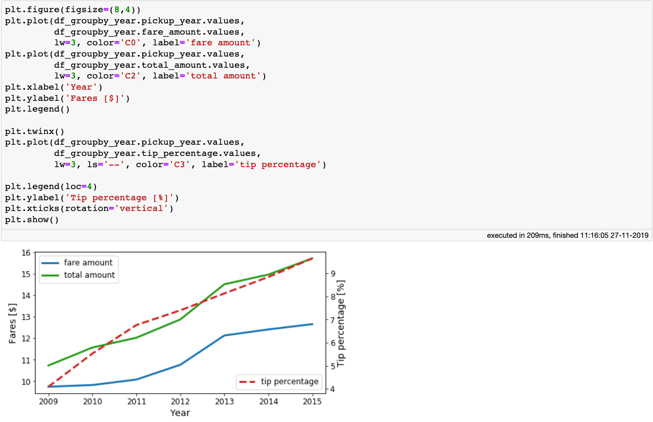 The average fare and total amounts, as well as the tip percentage paid by the passengers per year.
We see that the taxi fares, as well as the tips increase as the years go by. Now let’s look at the mean trip_distance and arc_distance the taxis travelled as a function of year:
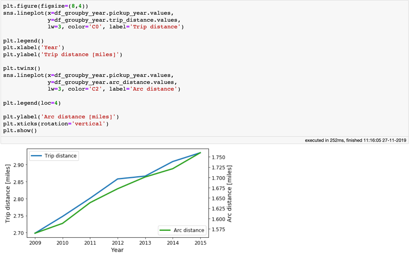 The mean trip and arc distances the taxis travelled per year.
The figure above shows that there is a small increase of both the *trip_distance *and arc_distance meaning that, on average, people tend to travel a little bit further each year.
Show me the money
Before the end of our trip, let’s make one more stop and investigate how passengers pay for their rides. The dataset contains the payment_type column, so let’s see the values it contains:
From the dataset documentation, we can see that there are only 6 valid entries for this column:
-
1 = credit card payment
-
2 = cash payment
-
3 = no charge
-
4 = dispute
-
5 = Unknown
-
6 =Voided trip
Thus, we can simply map the entries in the payment_type column to integers:
Now we can group-by the data per year, and see how the habits of the New Yorkers changed when it comes to taxi ride payments:
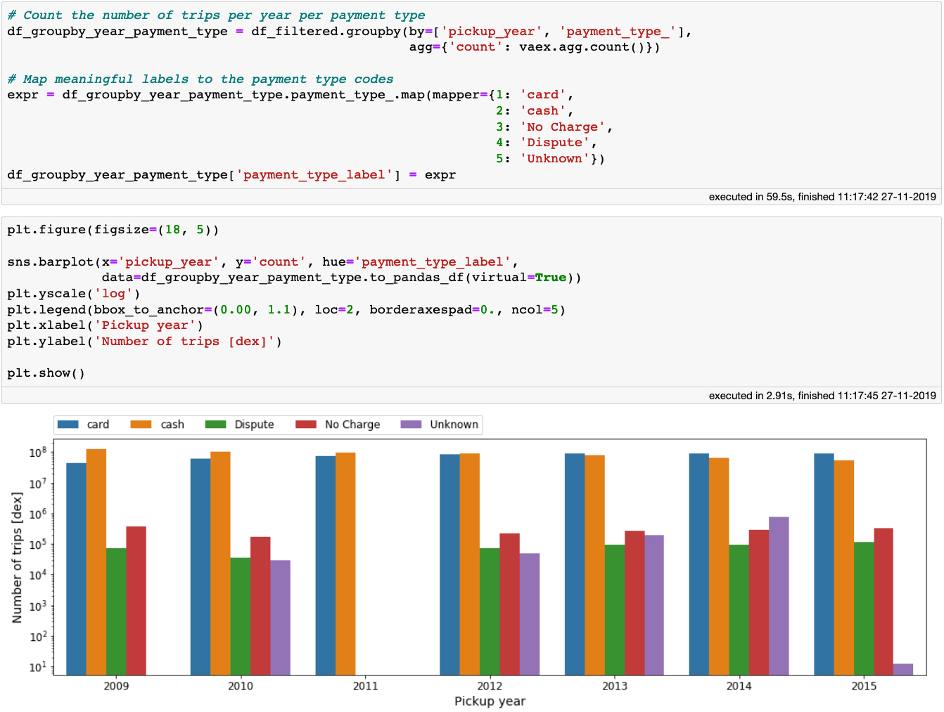 Payment method per year
We see that as time goes on, the card payments slowly became more frequent than cash payments. We truly live in a digital age! Note that in the above code block, once we aggregated the data, the small Vaex DataFrame can easily be converted to a Pandas DataFrame, which we conveniently pass to Seaborn. Not trying to reinvent the wheel here.
Finally, let’s see whether the payment method depends on the time of day or the day of week by plotting the ratio between the number of cash to card payments. To do this, we will first create a filter which selects only the rides paid for by either cash or card. The next step is one of my favourite Vaex features: aggregations with selections. Other libraries require aggregations to be done on separately filtered DataFrames for each payment method that are later merged into one. With Vaex on the other hand we can do this in one step by providing the selections within the aggregation function. This is quite convenient, and requires just one pass over the data, giving us a better performance. After that, we can just plot the resulting DataFrame in a standard manner:
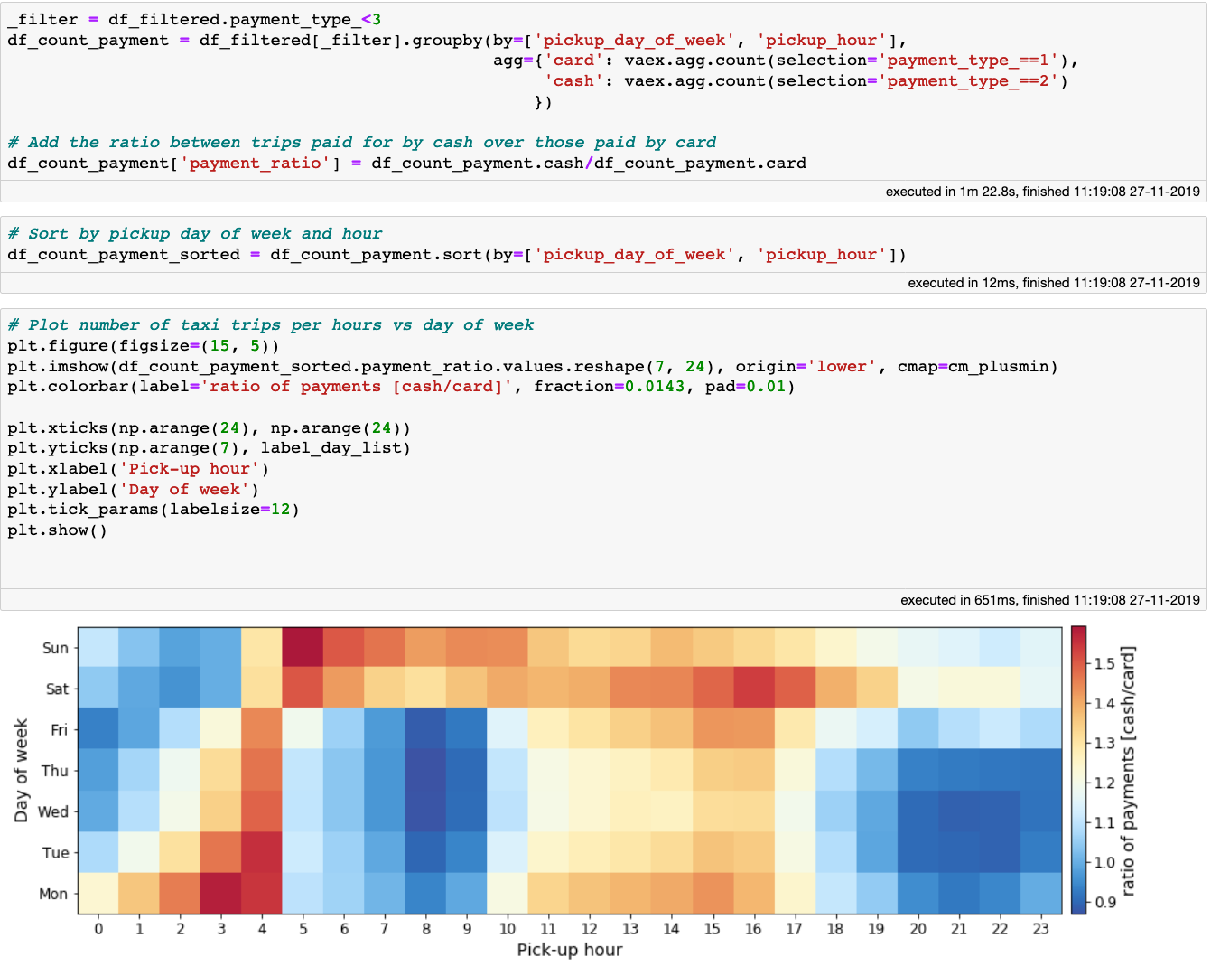 The fraction of cash to card payments for a given time and day of week.
Looking at the plot above we can notice a similar pattern to the one showing the tip percentage as a function of day of week and time of day. From these two plots, the data would suggest that passengers that pay by card tend to tip more than those that pay by cash. To find out whether this is indeed true, I would like to invite you to try and figure it out, since now you have the knowledge, the tools and the data! You can also look at this Jupyter notebook for some extra hints.
We arrived at your destination
I hope this article was a useful introduction to Vaex, and it will help you alleviate some of the “uncomfortable data” issues that you may be facing, at least when it comes to tabular datasets. If you are interested in exploring the dataset used in this article, it can be used straight from S3 with Vaex. See the full Jupyter notebook to find out how to do this.
With Vaex, one can go over a billion rows and calculate all sort of statistics, aggregations and produce informative plots in mere seconds, right from the comfort of your own laptop. It is free and open-source, and I hope you will give it a shot!
Happy data sciencing!
The exploratory data analysis presented in this article is based on an early Vaex demo created by Maarten Breddels.
Please check out our live demo from PyData London 2019 below: